Responsive layout grid
September 19, 2023
What is?
Responsive layout grid adapts to screen size and orientation, ensuring consistency across layouts.
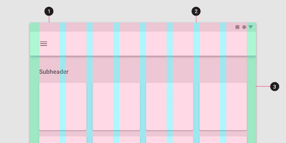
The responsive layout grid is made up of three elements: columns (1), gutters (2), and margins (3).
Column
Content is placed in the areas of the screen that contain columns.
In responsive layouts, column width is defined with percentages, rather than fixed values. This allows content to adapt to any screen size. The number of columns displayed in the grid is determined by the breakpoint range, a range of predetermined screen sizes. A breakpoint can correspond with mobile, tablet, or other screen type.
Gutters
A gutter is the space between columns that helps separate content.
Gutter widths are fixed values at each breakpoint range. To better adapt to a given screen size, gutter widths can change at different breakpoints.
Margins
Margins are the space between content and the left and right edges of the screen.
Similar to Gutters, Margin widths are defined using fixed or scaling values at each breakpoint range. To better adapt to the screen, the margin width can change at different breakpoints.
Breakpoints
A breakpoint is the screen size threshold determined by specific layout requirements. At a given breakpoint range, the layout adjusts to suit the screen size and orientation.
Each breakpoint range determines the number of columns, and recommended margins and gutters for each display size.
Reference
https://m2.material.io/design/layout/responsive-layout-grid.html
